First, I'll review the functionality of the component I introduced in the last article.
- The component features an input control
- An event handler,
HandleInput, is wired up to the input event of the control - As the user types, the event handler executes.
- The handler checks the length of the input's value. If the length exceeds 2, a request is made to an API that returns any customers whose names include the input value.
- Customers returned by the API are displayed in an unordered list positioned just below the input.
- If the user selects a customer by clicking on it, a method that is wired
up to the list item's click event,
SelectItem, fires. - The selected customer 's name is assigned to the input and its name and key value are rendered as part of a confirmation message.
- The existing data from the API is nullified, removing the unordered list from the UI.
Now I'll focus on the factors that prevent the existing component from being reused in other parts of the application. Let's review the code section where the data and behaviour of the component is defined:
@code {
    List<Customer>? customers;
    string? selectedCustomerId;
    string? selectedCustomerName;
    string? filter;

    async Task HandleInput(ChangeEventArgs e)
    {
        filter = e.Value?.ToString();
        if (filter?.Length > 2)
        {
            customers = await http.GetFromJsonAsync<List<Customer>>($"/api/companyfilter?filter={filter}");
        }
        else
        {
            customers = null;
            selectedCustomerName = selectedCustomerId = null;
        }
    }

    void SelectCustomer(string id)
    {
        selectedCustomerId = id;
        selectedCustomerName = customers!.First(c => c.CustomerId.Equals(selectedCustomerId)).CompanyName;
        customers = null;
    }
}
The main issue that potentially prevents this component from being used
elsewhere in the application is its dependency on one specific datatype -
Customer. If we want to provide an autocomplete service that works with a
Product datatype, for example, we need to rewrite it. The component
also relies on a specific hardcoded API endpoint. Ideally, we want the calling
component to pass in these two pieces of data. The API endpoint is simply dealt
with - it's just a string after all. First I'll create a Razor component in a
file called AutocompleteComponent.razor and then add a parameter to the
code block to cater for the API url. I have also added the
EditorRequired attribute so that the IDE provides a warning if no
value is specified for the parameter:
[Parameter, EditorRequired] public string? ApiUrl { get; set; }
The datatype is another matter.
When creating the autocomplete component, we have no idea what type of data
consumers will want to work with. We need to accommodate any type of
data. In order to do that, we leverage Razor components' support for
generic type parameters. Essentially, the generic type parameter acts as a
placeholder for a type that is passed in by the calling component. The generic type
parameter is added to the top of the Razor component using the typeparam directive:
@typeparam TItem
The autocomplete component will be responsible for creating the actual data in response to
the user typing into the form control, but we also
need to be able to manipulate that data from outside of the component. For
example, in the current component, we set the data to null to clear
the list of options from the UI. So we
need to add a container for the data but we also need to make it a public
property and add a Parameter attribute to it:
[Parameter, EditorRequired] public IEnumerable<TItem>? Items{ get; set; }
Let's take a look at a piece of markup in the original component. It renders details of the selected item, which in this case is a customer:
@if (!string.IsNullOrWhiteSpace(selectedCustomerName))
{
    <p class="mt-3">
        Selected customer is @selectedCustomerName with ID <strong>@selectedCustomerId</strong>
    </p>
}
Now that our component is generic, references such as "Selected customer" no
longer make sense. At design time, we don't know what the consumer might want to
render to the UI in the event of an item being selected, if anything at all, So
we'll leave this up to the consumer to provide by adding another parameter to
the component whose type will be RenderFragment - representing a fragment of
Razor code to be processed and rendered:
[Parameter] public RenderFragment? ResultsTemplate { get; set; }
Here's another piece of mark up from the original component. It is responsible for rendering the data returned by the API as options, and for adding an event handler for the click event of each option:
@if (customers is not null)
{
    <ul class="options">
        @if (customers.Any())
        {
            @foreach (var customer in customers)
            {
                <li class="option" @onclick=@(_ => SelectCustomer(customer.CustomerId))>
                    <span class="option-text">@customer.CompanyName</span>
                </li>
            }
        }
        else
        {
            <li class="disabled option">No results</li>
        }
    </ul>
}
We already have a replacement for customers in the new
component- Items. So we can replace most of this code quite easily:
@if (Items is not null)
{
    <ul class="options">
        @if (Items.Any())
        {
            @foreach (var item in Items)
            {
                @* TODO: Render Options *@
            }
        }
        else
        {
            <li class="disabled option">No results</li>
        }
    </ul>
}
We still need to decide how to render items as options, and how to react to the
click event of an option. In the original component, the implementation of both
of these tasks is type-specific, and the type is only known to the calling
component, so we will defer both tasks to the caller. First, we will enable the calling component to specify how each option is rendered
because it knows about the properties of the option's data type, whereas the
autocomplete component doesn't. So we will provide another RenderFragment
parameter, except this time, we will use the generically typed version that
takes a parameter:
[Parameter, EditorRequired] public RenderFragment<TItem> OptionTemplate{ get; set; } = default!;
Next, we'll deal with the click event handler which is currently assigned to the
li element that houses each option.
If you want a calling
component to be notified of events that occur in a child
component, you do so via an EventCallback parameter which
represents a delegate to be invoked in the parent component. We will use the strongly
typed EventCallback<TValue>, which enables the calling component to specify the
type of data to be passed to the parent component's callback function. We add
an EventCallback<TValue> parameter named OnSelectItem:
[Parameter, EditorRequired] public EventCallback<TItem> OnSelectItem { get; set; }
We need a way to invoke the OnSelectItem event callback. We
add a method to the component that takes a TItem as a parameter and
passes it to the callback's InvokeAsync method:
async Task SelectItem(TItem item) => await OnSelectItem.InvokeAsync(item);
Now the code that renders each option can be fitted in to the foreach loop that
has yet to be completed:
@foreach (var item in Items)
{
    <li class="option" @onclick="_ => SelectItem(item)">
        @OptionTemplate(item)
    </li>
}
We are almost there. In point 7 of the existing functionality, we set the value of the input to the selected product's name. We will allow the calling component to set this value - if it wants to, by providing a parameter and binding that to the input:
[Parameter] public string? SelectedValue { get; set; }
<input @bind=SelectedValue @oninput=HandleInput class="form-control filter" />
Finally, we refactor the HandleInput click event handler so that it works with the
ApiUrl
parameter and generic data:
async Task HandleInput(ChangeEventArgs e)
{
    filter = e.Value?.ToString();
    if (filter?.Length > 2)
    {
        Items = await http.GetFromJsonAsync<IEnumerable<TItem>>($"{ApiUrl}{filter}");
    }
    else
    {
        Items = null;
    }
}
Using the component
Now that we've built the component, we can use it in another component. In the download that accompanies this article, I've used it twice within the same page - once to get a list of customers, and the second to get a list of products.
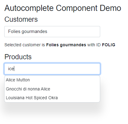
I'll only show the steps necessary to work with customer data here.
First, here's the code block in the calling component. It defines fields for the
customer data and the selected customer. It also includes a method named
SelectCustomer, which will be passed as a delegate to the
EventCallback parameter:
@code {
    List<Customer>? Customers;
    Customer? SelectedCustomer;

    void SelectCustomer(Customer customer)
    {
        SelectedCustomer = customer;
        Customers = null;
    }
}
Here's the opening tag for the component. We pass in the values for the
Items, SelectedValue and ApiUrl parameters. We also pass the name of the
SelectCustomer method as a delegate to the OnSelectItem parameter. And we pass
in Customer to the TItem parameter so that the autocomplete component knows
which type to pass back to the event callback:
<AutocompleteComponent Items="Customers"
                       SelectedValue="@(SelectedCustomer?.CompanyName)"
                       OnSelectItem="SelectCustomer"
                       TItem="Customer"
                       Context="customer"
                       ApiUrl="/api/companyfilter?filter=">
One other value was passed in; "customer" was assigned to the Context
parameter. This sets the name of the expression used in strongly typed
RenderFragment parameters. We have one of those - the
OptionTemplate parameter, which is added inside the opening and closing
AutocompleteComponent tags:
<OptionTemplate>
    <span class="option-text">@customer.CompanyName</span>
</OptionTemplate>
We can also provide content for the ResultsTemplate parameter
bfore the closing AutocompleteComponent tag if we like:
    <ResultsTemplate>
        @if (SelectedCustomer != null)
        {
            <p class="mt-3">
                Selected customer is <strong>@SelectedCustomer.CompanyName</strong>
                with ID <strong>@SelectedCustomer.CustomerId</strong>
            </p>
        }
    </ResultsTemplate>
</AutocompleteComponent>
Summary
If I need to use an autocomplete feature in multiple places within a Blazor
application, I no longer have to copy and paste the same code. I can centralise
it in one reusable and more maintainable component and delegate decisions on
data and some aspects of behaviour to calling components using @typeparam,
and strongly typed EventCallback and RenderFragment
parameters.
