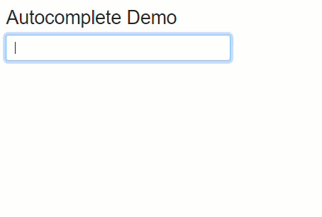
The example uses the Blazor WebAssembly app project template with the ASP.NET Core Hosted option selected to produce three projects - a client, server and shared project. In the example, I've hooked up to a version of the Northwind database. If you don't know what that is, find a grey-haired dev and ask them. As I type into a form control, the database is queried and customers whose names contain the string I am entering are returned and displayed in what looks like a dropdown control. When I select one of the suggested options, my selection is confirmed.
The control itself is just an ordinary text input and the results are
displayed in a ul element. They are placed in a
div element that has its position set to relative, which enables child elements to be positioned absolutely
within it. This is the key to positioning the unordered list of options so that
it appears to create a dropdown with the input control. Here's the CSS for the
autocomplete component:
.autocomplete {
  position: relative;
}
.autocomplete .options {
  position: absolute;
  top: 40px;
  left: 0;
  background: white;
  width: 100%;
  padding: 0;
  z-index: 10;
  border: 1px solid #ced4da;
  border-radius: 0.5rem;
  box-shadow: 0 30px 25px 8px rgba(0, 0, 0, 0.1);
}
.autocomplete .option {
  display: block;
  padding: 0.25rem;
}
.autocomplete .option .option-text {
  padding: 0.25rem 0.5rem;
}
.autocomplete .option:hover {
  background: #1E90FF;
  color: #fff;
}
.autocomplete .option.disabled {
  background-color: lightgrey;
  cursor: not-allowed;
}
.autocomplete .option.disabled:hover {
  background: lightgrey;
  color: var(--bs-body);
}
I've added some rounded corners and box shadow to the options so that they
more closely emulate the appearance of a dropdown in the browser. The blue
background that is applied to options when hovered over matches that which is
applied by the Chrome browser. I have also declared a disabled
style, which will be applied to a message that is displayed in the event of no
matches being found. Next, I'll move on to the code section of the component. This contains its
data and behaviour:
@code {
    List<Customer>? customers;
    string? selectedCustomerId;
    string? selectedCustomerName;
    string? filter;

    async Task HandleInput(ChangeEventArgs e)
    {
        filter = e.Value?.ToString();
        if (filter?.Length > 2)
        {
            customers = await http.GetFromJsonAsync<List<Customer>>($"/api/companyfilter?filter={filter}");
        }
        else
        {
            customers = null;
            selectedCustomerName = selectedCustomerId = null;
        }
    }

    void SelectCustomer(string id)
    {
        selectedCustomerId = id;
        selectedCustomerName = customers!.First(c => c.CustomerId.Equals(selectedCustomerId)).CompanyName;
        customers = null;
    }
}
A number of fields are declared. The first is a List<Customer>
which represents the options returned from the server. The second represents the
selected customer's key value, and the third, the name of the selected customer.
The last field will be used to store the value entered into the input control.
An event handler named HandleInput is added, which will be wired
up to the input event of the input control. It fires for every
character that is entered into or removed from the input control. The handler
checks the length of the input's value and if it is three characters or more,
calls an API that returns a list of customers which are assigned to the
customers field. If the input value is less than three characters the
customers field is set to null, along with the
selectedCustomerName and selectedCustomerId.
Another method, SelectCustomer is responsible for assigning the
selectedCustomerId and the selectedCustomerName based
on a string parameter representing the selected customer's key value. It is also
responsible for setting the customer field to null,
which clears all options.
The API is a minimal API endpoint registered in the server project's Program.cs file:
app.MapGet("/api/companyfilter", async (string filter, [FromServices] ICustomerManager manager) =>
    Results.Ok(await manager.GetFilteredCustomerNames(filter))
);
It calls a method on an implementation of the ICustomerManager interface
which is shown next:
public class CustomerManager : ICustomerManager
{
	private readonly NorthwindContext context;

	public CustomerManager(NorthwindContext context) => this.context = context;

	public async Task<List<Customer>> GetFilteredCustomerNames(string filter) =>
		await context.Customers
		.Where(c => c.CompanyName.ToLower().Contains(filter.ToLower()))
		.OrderBy(c => c)
		.ToListAsync();
}
This method gets all companies whose names include the text entered into the input. The company names and the filter value are converted to lower case in my example because I'm using a SQLite database where by default, string comparison are case-sensitive.
Back to the autocomplete component itself, here is the code for the UI part:
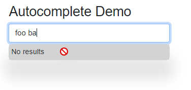
@page "/autocomplete"
@inject HttpClient http

<h3>Autocomplete Demo</h3>

<div class="autocomplete w-25">
    <input @bind=selectedCustomerName @oninput=HandleInput class="form-control filter" />
    @if (customers is not null)
    {
        <ul class="options">
            @if (customers.Any())
            {
                @foreach (var customer in customers)
                {
                    <li class="option" @onclick=@(_ => SelectCustomer(customer.CustomerId))>
                        <span class="option-text">@customer.CompanyName</span>
                    </li>
                }
            }
            else
            {
                <li class="disabled option">No results</li>
            }
        </ul>
    }
</div>
@if (!string.IsNullOrWhiteSpace(selectedCustomerName))
{
    <p class="mt-3">
        Selected customer is @selectedCustomerName with ID <strong>@selectedCustomerId</strong>
    </p>
}
The HttpClient service is injected into the component so that it
can be used by the HandleInput method to acquire the data as the
user types. Two blocks are of primary interest. The second of these only appears
if a customer name has been selected. It contains content that confirm the
selection details. The first block is the div with the
autocomplete class applied to it. This contains an input with the
selectedCustomerName bound to its value and the HandleInput
method bound to its @oninput attribute. If any matching customer
records are returned from the HandleInput method, the
ul.otpions is rendered, and individual options are rendered to list items
that have the SelectCustomer method bound to their onclick handler.
Each one takes the current customer's ID as a parameter. Remember, this is the
method that sets the selectedCustomerName and removes all the options.
If no matching results are found, the user is informed accordingly:
The source code for this article is available at https://github.com/mikebrind/Blazor-Autocomplete.
Summary
And there you have it. No third party libraries, no JavaScript. Just a very simple autocomplete written using C# and Razor that leverages the power of the Blazor framework to show and hide elements based on the state of the component's data. This almost feels like cheating.
